8/31/2016

August Creative Guest - Dee Adams

I stumbled on this creative lady during a blog hop and just fell in love - please welcome Dee Adams as our August Guest.

Creative Guest Facts

I was so proud and honoured to be asked to be the August guest Designer for Words and Paintery.
A little bit of info about me and how I got addicted to mixed media it started when my mother asking me to make her cards, as I delved into the craft world I stumbled onto mixed media and my obsession with texture & colour grew from there.

I was so lucky as when I got my first design team post I hadn't even got a blog, so in lots of ways I am still quite a novice to the internet side of crafting, but I am amazed at the talent and support that this wonderful obsession generates.

I am always surprised when I see other peoples work, as it always seems so smooth and polished and I have to run my fingers over it to understand how they have achieved it. Anyone who has seen my work will see that its very raw and edgy.


The project

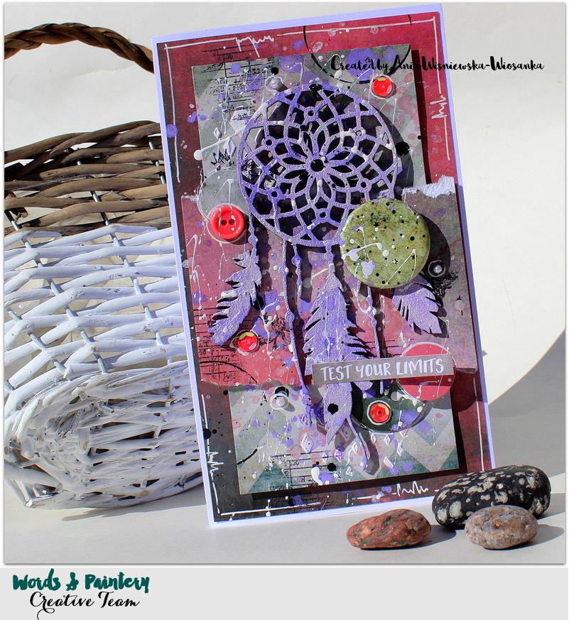
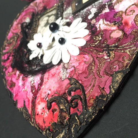
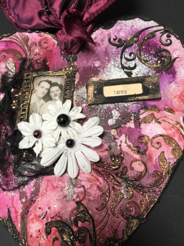
So looking at the mood board I was scared a-bit at the colours (as they really are not colours that I use). So my first challenge was how to work with the colours on the board, and how to incorporate the words etc. I settled on the word love and had a large wooden heart in my stash that would be ideal for altering.


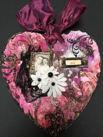
I started with White Gesso, followed by clear, which helps the colours pop when you apply them. 
Next I used the Tim Holtz florish stencil, put texture paste through, sprinkled with golf embossing powder and heat set.

I love the Ariondack colour washes as the colours are very vibrant, I also used some Lindy's stamp gang magicals, which I spritzed with water to activate. 


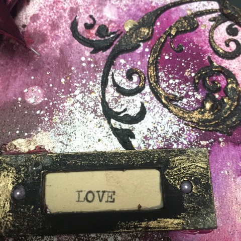
I flicked white, gold and black ink over the heart.
Once I was happy with the results I then used a Tando creative mini stencil of a flourish and put black embossing paste through it.


I was now beginning to enjoy myself and could see where I wanted this to go, my work tends to direct itself and at this point I could see my taste coming out in it. 
The Photo's I framed, dyed some lint with black soot ink, I typed the word love on my typewriter and used a Tando chipboard letter plate to frame it. 
Finally a touch of treasure gold to highlight areas.


I hope you all enjoyed my project and have a go! As I said these were not my colours at all, but I actually enjoyed the challenge of making a piece that I would like. I hope that you all enjoyed my project and a big thank you to Marie and the team for inviting me along.

8/23/2016

August Creative Winner - Kareen Dion

Say Hi to our challenge winner from June 2016! This beautiful entry from her took her all the way to our Creative Guest Post...

Creative Guest Facts


I'm Kareen or kjkareen on the "scraposphere" and I'm from Quebec, Canada. I'm a stay-at-home mom of two beautiful children (of course they're beautiful, they are mine! hihi) and I manage to have a lot of time to scrapbook! Do I have any particular style? I don't think so, I like to qualify myself that I am a clean mixed media girl! ahah And cluster style... But I can tell you that where I feel the best to create it's on a 12 x 12 layout! I need space, it's what I like the most! But, I sometimes do cards or canvas. It depends of my mood. I like to touch to everything, as long as I can create!

The Project


Thank you for the inspiration Kareen!

8/18/2016

July Winner & Top Picks

Thank you everyone who submitted to our July Challenge. We LOVED all the entries and to chose our winner and top picks was really hard (as usual...). Here they come:

Top Picks


Winner of the price pack from Marianne Design


Winner of the Gift Certificate from UmWowStudio


The two Winner Of the Challenge will be invited to join us as Creative Winner in September.

Please send us a mail at wordspaintery@gmail.com so we can arrange with your prize and more.

8/15/2016

August 2016

This month we give you a true challenge. Bold, bright colors and a for the season suitable quote.

The Challenge


The Rules

To participate you need to do your interpretation of our challenge and upload a direct link to your project with the help of our Linkytool. The interpretations are free in form (layout, card, art journal, album, canvas) but you need to follow the outlines of the challenge. Each month we will chose a couple of projects that will be highlighted in a special post.

Deadline to upload is September 15 (CET +1)

The Sponsor


"Pion Design is a family owned company located outside of Luleå in the northern part of Sweden. We are a manufacturer of scrapbooking papers in a vintage and romantic style and our papers are created and printed locally."

Pion Design has give a grand prize to the winner of the August Challenge - all 17 papers from the new collection "Greetings from the North Pole" (+ the palette papers).


This year Pion Design wants to share the magic of winter and Christmas with the paper collection Greetings from the North Pole. This collection invites you to a winter wonderland where you can immerse yourself in the beautiful scenery and surroundings of the home of Santa. You can almost hear the sparkle of the Northern Lights and the bells of Santas reindeer as Greetings from the North Pole captures the peace and serenity of the season. All the splendid patterns and images of Christmas bells, snow flakes and magical landscapes will make crafting memorable gifts and home decor a treat!
Greetings from the North Pole consists of 13 papers in the size 12x12”, including one image sheet, as well as 4 single sided papers in 12x12” with 4 designs in 6x6”.


Pion Design never settles for anything but perfection. When we heard that our customers were searching for solid papers to match our patterned papers we decided to design and print our own, using the unique Pion Design color palette. The result is the collection Pion Design Palette, a wide selection of subtle colored premium papers that make a beautiful foundation for every crafting project and that will go together with our patterned papers perfectly.

The papers in this collection are of a heavier weight than our patterned papers and can be used for altered projects or to add layers and dimensions to cards and layouts. These papers also have a white core which makes them perfect for embossing, distressing, sanding and tearing.

Design Team Projects

Lena Holmström

Mandy Leveer-Koel


Kava Craft

Sandra Bernard

Karine Gagnon

Ewelina Gryglak

Tusia Lech

Kripa Koushik

Mabel Sim

Catherine Giguère

Mary Catt

Natalie May

Marie Johansson

Jessika Lundman

Kavi Tha

Lisa Griffith

Anna Wiśniewska


Yulia Tirskaya

Please use the linkytool on the right sidebar to link up your entry!

We will be back soon with the winners & top 4 picks from the July Challenge.